I gessoed over everything in the photo except the grandbaby. The canvas took the gesso just fine but you can still see a little of the original photo under the gesso. I could have gessoed again but since this was just a kind of "fun" trial to salvage the canvas I just let one layer of gesso suffice. You can see the drawing that I started in this picture also. Then . . . .
I began to paint a scene incorporating the photo of the baby with the Disney characters. You can see the beast's hand holding the baby steady on his shoulder. Here's the completed painting. I think it turned out kinda neat and I learned that you can paint over a photo on canvas.
Friday, January 11, 2019
Photo on Canvas Salvage
Here's something kind of neat that I enjoyed doing. After a visit with my cousin in Atlanta I saw that she had ordered a photo of her daughter and grand-daughter to be printed on canvas. The photo was of the two of them dressed in yellow gowns like in the Disney movie "Beauty and the Beast". Her daughter was holding the baby in the pose but the picture came back with the daughters head folded onto the side of the canvas. Needless to say the company made it right so it was a beautiful canvas portrait. When I saw the messed up canvas I got a wild idea in my "Jane's Perspective" way to try to see if I couldn't do something creative with it SO...…
Tuesday, November 6, 2018
Uncle Si's portrait
Well, this was a nice surprise. A gal from my church took my portrait of "Uncle Si" to Phil Robertson last time she was there to visit. I did the portrait as a demo for a portrait workshop about a year ago and since I'm a big fan of "Uncle Si" and his "Si-isms" I thought I'd send it to him - not as a crazed fan - but as a thank you to him for the laughter from the show and the witticisms from his book that I have enjoyed over the years. Phil was kind enough to allow a picture of him holding the portrait with a promise to pass it on to Si. What an exciting place for my painting to go.
Tuesday, October 2, 2018
In the studio with a friend
Growing accustomed to my studio - it's becoming my "happy place". And now I have a painting friend joining me every now and then to paint and chit chat about art. You know, I say in my book, The $even $teps to $elling Your Artwork that painting can be a really lonely craft if you dedicate as much time to it as you need to be professional - you can be very alone in the studio. That's why if your life is hectic, it's so comforting to take up painting. Focusing on a work of art forces you to take some quiet time for yourself without the worldly noise and without the inner noise and worry that may come your way. Anyway, my painting partner is also giving me a much needed shot in the arm to shake up my "old" ways of thinking and putting some new younger ideas in my mind. He was a former student of mine who has just taken off with his own unique style. His name is Matt Riddle and I'm sure he'd be happy for you to take a look at some of his own artwork online. Meanwhile, here's a picture of a week's work for us. See if you can guess which one is his piece?
Thursday, August 30, 2018
In the Studio Week 1
Well, I've been able to spend my first week in the newly resurfaced studio. I had an added pleasure of having an art friend join me for two days to paint alongside me. Painting is a solitary profession or craft so it's nice to have a like soul to share the opportunity. Jane' s Perspective says it's fun to paint with someone else but equally important just to get your butt in there and paint. Like my husband says, I get a little "bitchy" if I go too long without painting. Here's a picture of what I was able to accomplish in acrylic paint that week - still needs some touching up on the smaller pieces, big one is 4' X 5' and it's done, the one on the easel only has it's underpainting AND the floor is a work in progress ( first spatters are already there!).
Thursday, August 16, 2018
Studio Tour
This is the second corner of my "new" studio.
Here's my moveable easel and my two rolling art paint bins. The one on the left holds all my oil paint and the one on the right holds all my acrylics. Both bins were Fred's Dollar Store finds and I'm able to categorize my colors drawer by drawer. The artwork on the easel are small oil paintings in progress and the artwork on the wall and below in the wooden divider are my "Do-Overs". These are thrift store artwork "re-purposed" in the style of the artist David Irvine. I just love the humor of re-directing art that has been cast away into something fun. Here's one of my favorite "Do-Overs". I call it "Savvy?" Just the idea of a stoic iconic boy in blue in the classic style with his "friend" no doubt whispering some trouble making scheme over his shoulder.
Next to this corner between the two front windows is my writing and inspiration area. My books are full of history of art, or how-to's for painting techniques, and some are just for ideas or to use as a resource. If I do nothing else for the day in the studio I hope to be able to just lose myself in art by pouring through these books.
Above the books is one of my largest paintings from a show I did after I returned from a trip to Italy. I have chosen not to sell this piece yet. It still reminds me of the day we saw the Sistine Chapel and Coliseum in Rome. It was a rainy day but as I took the reference photo the clouds just broke up to reveal some clear blue sky. And speaking of large artwork the next two corners of the room have two 4' X 5' canvases ready for one commissioned piece and a piece for my next showing in Gatlinburg, Tn.
In this picture you'll see I have a tv stand on which I've placed my lights that I can roll anywhere I need it in the studio. On it's shelf are all my paint brushes in cases or boxes by size and palette paper and wooden and plastic pallettes. The easel in this photo was a give away by an artist friend who had it made specifically for large pieces. The Coke machine is non working and has been a sorta thorn in my studio side for years - too heavy to move, too broken to use or sell. So it's just décor at this point. 👎
This corner shows two things, the other 4' X 5' canvas which I have now hung directly on the wall and will paint on it at that location and a desk I found at the Goodwill for $3.50 that holds my glass pallet and more painting supplies like mediums and paper towels and palette knives. It rolls wherever I need it. So that totals three areas in which I can paint. I just roll the palette and light tables to whichever canvas I choose to work on allowing me to let one piece dry as I work or prep another.
The final wall of the studio has all the odds and ends from papers, sketch books, markers, pastels, old photos of past shows and artwork, extra tubes of paint, colored pencils, and watercolors. It also holds all the memorabilia from the gallery I owned in the early 2000's and teaching materials for my workshops. The paintings above are just some of my favorites, a Beale Street palette knife piece, a painting from my trip to Italy, a portrait of my husband and a portrait of my sons. Smaller pieces on easels are a portrait of my youngest son, a landscape where we used to go camping a lot, a small Do-Over and a wooden plaque that my oldest son made for me one Christmas. Fun pieces like this will surround me and keep me from being lonely as I work. Art can be a rather lonely profession but if it's in you to paint you'll suffer more from not releasing your creativity than you would bottling it up cause you don't want to be alone.
Wednesday, August 15, 2018
My "New" Studio
Today is the first day of the rest of my life. I turned 65 yesterday so today I begin a new chapter with a newly decorated and sorted out studio. I'm ready to paint full time, full steam ahead. Let me show you my new studio and share some studio set up ideas with you. Now all of this is done on the "cheap" so you won't find thousands of dollars worth of equipment but you'll find more along the lines of tens of dollars used wisely and many time repurposed or doing double duty. Here's the first corner.
I'm lucky enough to be able to use an enclosed two car garage at my house so that I can spread out to work on my artwork. The room was enclosed from the get go when we built the house and served as the kid's playroom. Well, they're up and grown so now it's mine (insert evil "hee hee hee" here). To the left in this picture you see part of the sliding glass door. We live on 10 acres abounding with deer that sometimes like to come within three feet of that window and just stare in at me as I work. This particular wall is covered with OPA (Other People's Art). I have a Kentucky Antique store find in the upper left hand corner - haven't a clue who the artist was but I love the depiction of an artist at work. To the right of that piece is a painting my dad did of me in my little room. Of course it has a place of honor due to the sentiments of the piece. That's my little bed. I still have the headboard to it. It had little drawers in the headboard where I hid candy as a child. He's painted me on my knees praying which I'm not sure where that came from - I'm a lay on my back in bed and pray to God thru the ceiling kind of gal but again, I like the sentiment. The piece below also has an honored space. It was painted by my youngest son, Lucien Scott Croy, when he was in high school. He is colorblind and doesn't paint much anymore. He prefers to work in charcoal and now, over 10 years later, has a one man showing of his work at the Playhouse in Memphis, Tn. But let's not get me to bragging too much right now - you can check out his work for yourself on his facebook page. Anyway, this painting was one of the first completed paintings he did working with his colorblindness. The painting is of an atrium which used to be in a building in downtown Memphis. It had green trees and a fountain with blue water and cream colored walls on the shops surrounding the atrium. I particularly love this picture just because of the reds and oranges he "saw" that he painted in the green tree leaves, the yellows and greens he "saw" in the water and the green cast he gave the cream colored stucco walls. Its' colors serve to inspire me to create my own surprising colors for the underpaintings of my artwork. Below that painting is a palette shaped table (a really cool 40% off Hobby Lobby find) and two portfolios full of more OPA's. And the stools you see were given to me by my art friend Lori Tooker. I took off the cushions and reupholstered them using the cloth of old aprons that I've used that were covered with paint. They look like abstract paintings on canvas on the seats of the chairs. There's a cool re-use for you. Old aprons for upholstery!
And before we leave this little corner and it's ideas, here's where I get onto my Jane's Perspective Soap Box about OPA's! ARTISTS SHOULD BUY FROM OTHER ARTISTS!!! It's not shameful. It's encouraging to other artists that you admire their work enough to purchase it. And you help support other artists by buying their work that you admire, appreciate, need to own to inspire you, or just because it's something that you know that you cannot do - no shame in that - you can't be successful (or shouldn't be successful) in every painting style. For example, abstract art is not my forte - I tend to overwork them - but I have a great appreciation for someone who can do abstracts well. So I buy wonderful pieces of abstract art when I can. I also sorta suck at collage style pieces so I buy those also. Then sometimes I just have artist friends who would gladly give me or trade me a piece which I have known to do but many times I insist on purchasing that piece. I am always on the lookout for pieces by artists I know and love and have been fortunate enough to purchase originals, or prints, or just small pieces or studies when I couldn't afford the larger works, that made me one of their collectors. Buying from other artists - as Martha Stewart would say, "It's a good thing". Trust me.
Saturday, May 12, 2018
This is interesting. I tried to just duplicate a painting using very cheap paints and very expensive paints. The results were 8 votes to 4 in favor of the cheap paint. I have to admit there was more blue green in that painting as a result of mixing my greens and that attracted a lot of people but to me it just goes to show that you don't have to have the most expensive tools to paint successfully. As I tell my students, "If it ain't broke, don't fix it". In other words, if you want to start painting use what you got, or get a little started kit at the craft store, or dust off that old set from college. Just start painting and when you see that your blues aren't blue enough or the paint doesn't flow like you want, or if anything is making you unhappy, then head to the store for a solution whether it be more expensive paint or a medium to make painting more enjoyable. Like my husband always says when I have to do something I dread "Well, the main thing is to have fun" and that's what I say to you if you want to start painting. Just have fun.
Here's the pictures again to remind you that the one on the right was done with very inexpensive paint and the one on the left was done with very expensive paint. Thanks for everyone's input. It was fun!
Wednesday, May 9, 2018
Friday, May 4, 2018
Painting in oils in a new style. Working hard to establish lights and darks. Took the painting of Ober Gatlinburg to American Sideshow in Gatlinburg. John really liked it so I'm gonna try for some more in this style. Only had three of my 8 people in class on Thursday so I decided to paint right along with them. The results - a kind of nice painting of daisies done on my Goodwill found table easel. Only $5.99 including the box, palette, brushes and really "cheap" tubes of acrylic and oil. Sort of like a kid's set but I tried it out anyway. Paint worked fine but I'm going to try to same picture using my better quality paints and see what difference there is. Some people are so picky about the paints they use so I'm going to try to see the comparisons.
Saturday, February 25, 2017
Whoo -eee! I'm getting so good at this computer thingy (not really) so when I say I've started a Kickstarter fund complete with a video of my cute self, that is no small accomplishment. BUT I did it and it's up and running. Now it needs funds. You see, I made a home-made DVD to show you how to draw a portrait. It's just chock full of information but it's kinda home-made. I even used shop lights as my fill lights and for lack of knowing how to edit, I did the whole thing over and over until I "got it right". I found out that there is a really good studio near my home in Bartlett, Tn. that has a full studio, proper camera and lights, and professionals to edit my next DVD, tentatively titled "The Easy 5 color method for Painting the Portrait in Oil" Tentative, cause I know I need a snappier title. Anyway, the campaign is on for only 60 days beginning today to raise funds to get me in that studio so that I can make the DVD and keep it's sale price reasonable. You can donate any amount and nothing will be charged unless I reach my goal of $1200 by April 26, 2017. That amount gets me about a 1/2 day in the studio and about 4 hours of professional editing for my DVD. I've got gifts to give you for $15, $25, and $35 pledges so check it out and spread the word. Just go to Kickstarter.com and hit search and/or advanced search and type in my name, Jane Croy and you'll see my awesome ?!?!? video and further info. And Thanks in advance for helping me out.
Friday, April 6, 2012
Painting Plein Air
I'm going to be teaching a beginning acrylic plein air workshop at the Botanic Gardens in Memphis Tennessee on May 9 and May 12, 2012 (contact the Botanic Garden if you'd like to come) so I thought I'd give you a little information to make painting plein air a little easier.
Painting plein air is so wonderful in the beautiful spring and fall weather and such a delightful thing to do in a public garden or just in your own back yard. But wherever you choose to go, hauling all your paints and supplies can be difficult and make the day just one big chore.
Here's what I recommend for painting plein air in acrylics.
Supplies you will need include: your paint
your brushes
a water supply and bucket to put it in
canvas(s)
a portable easel
and optional paper towels, and garbage sack, apron, and stool.
Here's a picture of the "pile" that you'll be toting.
Allow me to simplify this "pile" in my own Jane's Perspective way. First of all you don't need ALL of your paints. Concentrate on the color wheel as you pick a basic red, yellow and blue, then add a green, orange, purple, black and white. You can mix anything else you need from these colors and a regular size tube of each color weighs in at merely ounces so you're only up to carrying a pound at the most so far. I once painted on a beautiful spring day when the green grass was growing, the green buds were shooting up all around me, and the trees were covered in green leaves - so what color did I forget to pack? Green! So I mixed blue and yellow all day and got some fabulous greens. So don't sweat the hundreds of tubes of paints you think you might need. You can get by on way less and it can be a wonderful challenge to your color mixing abilities.
Likewise for your brushes, pick out all the brushes you want to take and then cut your number of choices in half. Make sure to add a fan brush and a small house paint size brush (if you do a wash of sky like I do to begin with).
The easel should be metal or wood and should fold up easily and extend easily. To pick a portable easel, the best rule of thumb is to get the cheapest foldable one. It's hilarious to me how difficult so many of those high priced, so called "easy up" portable easels are to actually set up on location. Plus many of them are super heavy. So get a cheaper easel until you see how much more you actually need. Jane's Perspective is that if it ain't "broke", don't buy it.
Your heaviest piece of equipment will be the water jug. By the end of the day, this will also be your lightest piece of equipement and possibly discardable if there is a proper receptical nearby. I don't recommend using lake or ditch water - Blech, I can't imagine what that might do to your brushes or paints. To "kill two birds with one stone" I like to take either a 1/2 gallon or less size container of drinking water so that I also have something to quench my thirst on a hot day.
Your most awkward piece of equipment is your canvas(s). I like to go all out with a 16 X 20 or two but you can easily do smaller paintings with flat 8 X 10 or 9 X 11 canvases. Smaller canvases are packable while larger ones need to be carried seperately. I have a friend who makes canvas carriers for her oil paintings and they come in handy for oil paintings done in classes but for plein air, it's just another thing to tote plus this blog is about acrylic painting so our canvases can be stacked easier. They'll be dry before we even pack up to leave.
Paper towels, an apron, a snack or lunch, plus a garbage sack finish our the supplies but they can all be carried easily as you can see in this "gee I need to lose weight" picture.
Here's how I do it. In the garden section of my local super store, I found a folding stool that had an attached pouch. When you unfold the stool, the zippable pounch is as big as the whole underside. On the outside of the pouch were pockets for garden tools. Inside the pouch I was able to fit my paints which were stored in the waterbucket (an ice cream size plastic container) along with my water and apron, a small roll (not a new roll) of paper towels and a snack or lunch in a baggie that became my garbage sack. Jane's Perspective says to look for "double duties" for each item. Outside I slide all of my brushes into the pockets. Once folded back up, the stool legs became the handles. Canvases and an easel fit nicely under my arms and I'm good to go. That makes only three basic things I have to pick up to carry. If you can't find a stool like I use, a folding stool without the pouch can be slung over your shoulders OR you may not even desire to sit down while you paint. Another option to sitting is to carry a small blanket instead of a stool, spread it out on the ground, and use a table easel. With lunch, you'll feel like you are on a picnic.
Painting plein air is so wonderful in the beautiful spring and fall weather and such a delightful thing to do in a public garden or just in your own back yard. But wherever you choose to go, hauling all your paints and supplies can be difficult and make the day just one big chore.
Here's what I recommend for painting plein air in acrylics.
Supplies you will need include: your paint
your brushes
a water supply and bucket to put it in
canvas(s)
a portable easel
and optional paper towels, and garbage sack, apron, and stool.
Here's a picture of the "pile" that you'll be toting.
Likewise for your brushes, pick out all the brushes you want to take and then cut your number of choices in half. Make sure to add a fan brush and a small house paint size brush (if you do a wash of sky like I do to begin with).
The easel should be metal or wood and should fold up easily and extend easily. To pick a portable easel, the best rule of thumb is to get the cheapest foldable one. It's hilarious to me how difficult so many of those high priced, so called "easy up" portable easels are to actually set up on location. Plus many of them are super heavy. So get a cheaper easel until you see how much more you actually need. Jane's Perspective is that if it ain't "broke", don't buy it.
Your heaviest piece of equipment will be the water jug. By the end of the day, this will also be your lightest piece of equipement and possibly discardable if there is a proper receptical nearby. I don't recommend using lake or ditch water - Blech, I can't imagine what that might do to your brushes or paints. To "kill two birds with one stone" I like to take either a 1/2 gallon or less size container of drinking water so that I also have something to quench my thirst on a hot day.
Your most awkward piece of equipment is your canvas(s). I like to go all out with a 16 X 20 or two but you can easily do smaller paintings with flat 8 X 10 or 9 X 11 canvases. Smaller canvases are packable while larger ones need to be carried seperately. I have a friend who makes canvas carriers for her oil paintings and they come in handy for oil paintings done in classes but for plein air, it's just another thing to tote plus this blog is about acrylic painting so our canvases can be stacked easier. They'll be dry before we even pack up to leave.
Paper towels, an apron, a snack or lunch, plus a garbage sack finish our the supplies but they can all be carried easily as you can see in this "gee I need to lose weight" picture.
Wednesday, October 26, 2011
Millington Mural Day 3
Day three I walk in to see my work. I'm always telling my students to put their artwork somewhere so that it will be the first thing they see in the morning. With a fresh perspective on seeing it, any mistakes or things that they want or need to change will "pop out" at them. It's a great way to either pat yourself on the back for a job well done or see immediately what needs more work. As I walked into the room to see this mural I was patting myself on the back. It actually came out way better than I imagined and it got done within my schedule. Meetings could resume in this room without any delays.
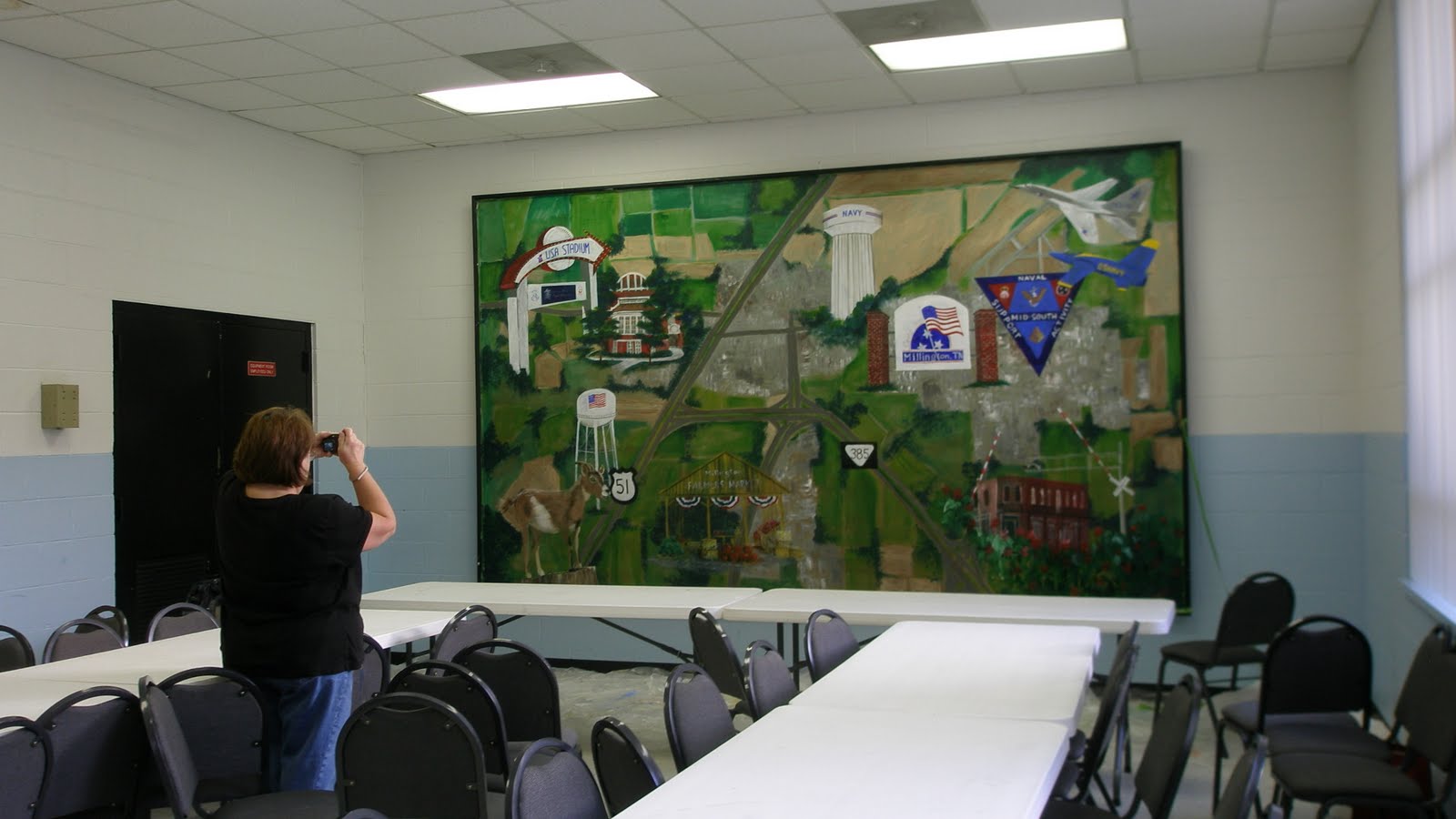
If you still can't tell how big this piece is by this photo of me standing at the corner, here's Jule photographing the piece with the room tables set up.

All I had left to do was to varnish the mural. I was able to put three coats of acrylic varnish over it on the last day. It took a full day to varnish it but I taught classes as I waited for each coat to dry. I suggested to the manager of the center that they discourage the taping of posters or excessive touching of the piece for a few months, at least. But my best suggestion is that if they or you have a large mural that was expressly created by an artist or that you desire to keep for any extended period of time, an investment in a plexiglass cover would keep your piece beautiful for years to come.
If you still can't tell how big this piece is by this photo of me standing at the corner, here's Jule photographing the piece with the room tables set up. 
All I had left to do was to varnish the mural. I was able to put three coats of acrylic varnish over it on the last day. It took a full day to varnish it but I taught classes as I waited for each coat to dry. I suggested to the manager of the center that they discourage the taping of posters or excessive touching of the piece for a few months, at least. But my best suggestion is that if they or you have a large mural that was expressly created by an artist or that you desire to keep for any extended period of time, an investment in a plexiglass cover would keep your piece beautiful for years to come.
Millington Mural Day 2
Day two began as early as I could get into the building. With google map in hand I painted the major highways into town and blocked in light brown fields. The city buildings on the map are hundreds of little squares. Since this will be the background for the mural, that much detail was not needed. I found that a good square brush and a mixture of white and greys painted in horizontal and vertical strokes created enough definition.
After the buildings were put in place I was able to use a mixture of greens to paint fields and sponge larger masses of trees.
After a break I began in the upper right hand corner blocking in the planes. I painted shadows on the planes just as I saw them on my reference photos so there was actually no complicated thinking of which way a cast shadow would go or where the sun light was coming from. I found myself identifying, instead, weird shapes and triangles darks and lights on the planes bodies.
When it came to detailed signage I used painters tape to block off straight edges. Many of the sign areas had to be double coated but with time of the essence I found that I could easily paint two to three coats in between working on sketching or painting other parts instead of just "waiting for paint to dry".
Jane's Perspective is all about the tricks and techniques of painting that create realism without all the hassle. For example, the brick pillars that held the "Welcome to Millington" sign needed shadows on one side. I painted (as you can see from the top of the pillar) one side a darker grey than the other. Then I painted the bricks using a square brush that was the exact width of the bricks I wanted to create AND I painted each brick the same color. Because the "morter" was darker on one side, it makes it look like the bricks were a darker color also.
To sketch everything in place, I used while chalk. If you look carefully you can see the lines of the chalk around the building painted in the lower right hand corner of the mural. Once painted, any excess chalk was simply wiped away with a rag or a slightly dampened paper towel.

About 2:00 in the afternoon, I figured how many more "sites" or signs that I had left to paint, figured how long I could physically work without getting too tired, and divided up the time left so that I could push myself yet take enough breaks so the work would continue to be good. Setting these goals helped because by 6:00 I was ahead of myself, took a supper break, and came back to fine tune the piece. With a three day goal in mind I was able to allow the mural to dry overnight before coming back to varnish it.
After the buildings were put in place I was able to use a mixture of greens to paint fields and sponge larger masses of trees.
After a break I began in the upper right hand corner blocking in the planes. I painted shadows on the planes just as I saw them on my reference photos so there was actually no complicated thinking of which way a cast shadow would go or where the sun light was coming from. I found myself identifying, instead, weird shapes and triangles darks and lights on the planes bodies.
When it came to detailed signage I used painters tape to block off straight edges. Many of the sign areas had to be double coated but with time of the essence I found that I could easily paint two to three coats in between working on sketching or painting other parts instead of just "waiting for paint to dry".
Jane's Perspective is all about the tricks and techniques of painting that create realism without all the hassle. For example, the brick pillars that held the "Welcome to Millington" sign needed shadows on one side. I painted (as you can see from the top of the pillar) one side a darker grey than the other. Then I painted the bricks using a square brush that was the exact width of the bricks I wanted to create AND I painted each brick the same color. Because the "morter" was darker on one side, it makes it look like the bricks were a darker color also.
To sketch everything in place, I used while chalk. If you look carefully you can see the lines of the chalk around the building painted in the lower right hand corner of the mural. Once painted, any excess chalk was simply wiped away with a rag or a slightly dampened paper towel.
About 2:00 in the afternoon, I figured how many more "sites" or signs that I had left to paint, figured how long I could physically work without getting too tired, and divided up the time left so that I could push myself yet take enough breaks so the work would continue to be good. Setting these goals helped because by 6:00 I was ahead of myself, took a supper break, and came back to fine tune the piece. With a three day goal in mind I was able to allow the mural to dry overnight before coming back to varnish it.
Tuesday, October 25, 2011
A Mural in Three Days - Day 1
I teach painting classes at the Baker Community Center in Millington, Tennessee. At the end of the hall is a room with a large wall mural. As you can tell from this picture, the mural had a lot of damage to it (not the stuff in the lower right hand corner but the pieces of mural that were coming off the wall). The manager at the center asked me if I could do a mural in it's place. "Sure" says I. After getting some photos of the area I make a plan to paint an arial view of Millington on the wall with different outstanding locations and attractions painted in a collage effect over the map. "Good plan" says I and with paint in hand I proceed to paint the background over the present mural only to find that the "mural" is actually just a wall papered photo. As the wet paint touches the paper, the "mural" crinkles and the paper proceeds to come off the wall. There is nothing to do but strip the wallpaper off the entire surface of the wall and then begin my painting. "Easy enough" says I only to find that after one hour, the lower right hand corner is all I've been able to scrape off.
In a panic (since I have allowed myself only three days to create this masterpiece) I call one of my art students who lives close by. Jule, the self professed queen of "Get it done now" comes to my rescue with wallpaper remover and within about three or four hours we get the whole thing removed. Here's Jule scraping away at it. She and I are both about the same height so our shortness was a definate issue in the difficulty of the wallpaper removal.
In an attempt to keep as close to my three day schedule as possible, I stay later than I planned at the community center and base coat the wall. This was done with regular house paint and since I didn't have enough of one color I had to mix in a second color at the bottom but I think it did just fine since I knew the whole thing would be covered up later. The graduation of color kind of helped in the creation of a more attractive background, too. It kinda made for a neat abstract or is that just Jane's Perspective?
My plan had been to actually finish the background and the arial map. But considering it took half the day just to get the mural off the wall, I'm satisfied with getting the base coat finished. Plus, I was pretty tired by this time. Painting a mural as big as this one which was 10' X 16' is hard enough. Scraping wallpaper off the area first added to my fatigue. I was looking for a BC powder and a good night's sleep before I began day 2.
In a panic (since I have allowed myself only three days to create this masterpiece) I call one of my art students who lives close by. Jule, the self professed queen of "Get it done now" comes to my rescue with wallpaper remover and within about three or four hours we get the whole thing removed. Here's Jule scraping away at it. She and I are both about the same height so our shortness was a definate issue in the difficulty of the wallpaper removal.
In an attempt to keep as close to my three day schedule as possible, I stay later than I planned at the community center and base coat the wall. This was done with regular house paint and since I didn't have enough of one color I had to mix in a second color at the bottom but I think it did just fine since I knew the whole thing would be covered up later. The graduation of color kind of helped in the creation of a more attractive background, too. It kinda made for a neat abstract or is that just Jane's Perspective?
My plan had been to actually finish the background and the arial map. But considering it took half the day just to get the mural off the wall, I'm satisfied with getting the base coat finished. Plus, I was pretty tired by this time. Painting a mural as big as this one which was 10' X 16' is hard enough. Scraping wallpaper off the area first added to my fatigue. I was looking for a BC powder and a good night's sleep before I began day 2.Tuesday, August 23, 2011
Step 4
Now you are all set to just paint things as you see them in the photo or as you imagine them to be realistically. Here's the jacket and the guitar painted as I see them to be. Notice, however that as I paint if some of the underpainted color peaks through, I make a conscious decision to let it stay. I could choose to paint over the underpainting color until it goes away, but heck, what fun would that be. I'm loving the unexpected colors that peak through so I'm leaving them.
Here I've painted the star yellow and white but as I apply my paint I let thick portions stay (without smoothing them out) to add even more texture and I let the purple underpainting show through on parts. Notice how I've also thrown caution to the wind when it comes to creating straight lines to the star. It's the excitement I'm trying to capture, not the exact realism of a perfectly straight symmetrical star.
Now I begin to paint the background and you can see that the background (particularly around the face) is my backup to correcting shapes and errors that I want to refine. I can paint closer in on the forehead and cheek or leave some of the underpainting show to round out part of the chin. Don't just blindly paint the background in, use it to refine your painting.
As you paint the background you are not painting an object but you are painting the negative space or the space around the object.
Notice the drum set portion in this picture painted in it's realistic colors. The stands are painted but they are not very refined. Just a kind of sloppy line at this point.
As I paint the negative space (the space around the drum stands) or the background I begin to create the shape of the drum stands by NOT painting the drumstands.
Here's a wider view so you can focus on the objects I am creating by painting the negative space which in this case is also the floor of the stage.
Closer up on the right under the bass you can see the negative space painting creates the bass stand.
So now Elvis is coming to life. I add more details and then restrain myself in these impressionistic works from going "too far". With a painting like this you step back a lot to see what the piece looks like from a distance. When you get just to the point of recognition in the face or the objects you STOP.
As a result you don't have just a pretty painting of an image but you creat in your painting an excitement and emotion of the image. You have captured the spot light of the stage, the excitement of the performance and the performer - all in the unexpected colors of the painting. You can almost hear the music in the vibrations of the colors and the brushstrokes. I love to paint this way. I hope you enjoyed taking the step by step journey with me.
Here's a wider view so you can focus on the objects I am creating by painting the negative space which in this case is also the floor of the stage.
As a result you don't have just a pretty painting of an image but you creat in your painting an excitement and emotion of the image. You have captured the spot light of the stage, the excitement of the performance and the performer - all in the unexpected colors of the painting. You can almost hear the music in the vibrations of the colors and the brushstrokes. I love to paint this way. I hope you enjoyed taking the step by step journey with me.
Wednesday, August 10, 2011
Step 3
This entire blog looks like it's gonna be no more than 4 or 5 steps. That makes it sound easy and I hope you find it that way but if not never fear, just take it slowly. If you were to watch me demo this process you might see my hand and brush "fly" across the canvas but that's just the way I paint. There's no need for you to try to go that fast. I've been painting this way for over 20 years.
By the way if you are up to date on reading this blog, August 20, 2011 I'll be at the Wolf Chase Galleria in Memphis, Tennessee demonstrating this technique on a larger than life painting of Marilyn Monroe. I'll not only be using this process but some larger than usual paint brushes. There will be a whole lotta paint mess in the process. You'll undoubtedly see my hands work faster than you might as you first experience this process but I think you'll enjoy watching. If you can't get by to watch, here's more on the process.
You have already painted the background in opposite colors or some strange color that you selected. Now you are going to begin to paint the painting "for real". That means you will paint the real colors of each object ONLY don't get all caught up in the realistic aspect of this painting. It's all about the excitement of the colors. So as you create a brush stroke and an opposite color peaks through, take a moment to look at it and think about leaving it exposed.
For example, in this picture I have painted the guitar in yellow ochres and browns. My underpainted color was a dark blue and I was able to let it peak through on the shadow parts of the guitar. Step by step, you can see that I've painted the shadow on the pants in a dark brown.
Then I paint the dark blue/purple paints with their highlights. Notice how some of the yellow peaks through on the leg on the left. Not much is peaking through here however so you see that you can make a choice to leave lots of "peak thrus" or just a little "peak thrus" or no "peak thrus" at all. I have students who start this process and completely cover the strange colored underpaintings. Jane's Perpsective is if you like it, leave it. If you don't like it paint over it.
Things get really strange on the face. If you followed my blog about realistic portraits you'll see that I follow the same steps/process here only I just don't go in for all that detail. Just like in the realistic portrait, I start with the shadows. Here I've painted the shadows in dark brown over the blue face.
Next, just like in the realistic portrait, I paint the highlights that I see on the face.
Then I fill in the middle areas with the flesh tone of the face. If I work really fast some of the colors blend together right on the canvas. If they don't I get a block of color. If I like it I leave it. If I don't I continue to paint over it until I get a resemblance - not a perfect likeness - but a resemblance. After all this is an "impression" of the person.
You can see I also worked on the hands so that I wouldn't have to worry about mixing the exact skin color again. This can really be a problem in acrylics unless you have a stay wet palette or are good at matching colors.
By the way if you are up to date on reading this blog, August 20, 2011 I'll be at the Wolf Chase Galleria in Memphis, Tennessee demonstrating this technique on a larger than life painting of Marilyn Monroe. I'll not only be using this process but some larger than usual paint brushes. There will be a whole lotta paint mess in the process. You'll undoubtedly see my hands work faster than you might as you first experience this process but I think you'll enjoy watching. If you can't get by to watch, here's more on the process.
You have already painted the background in opposite colors or some strange color that you selected. Now you are going to begin to paint the painting "for real". That means you will paint the real colors of each object ONLY don't get all caught up in the realistic aspect of this painting. It's all about the excitement of the colors. So as you create a brush stroke and an opposite color peaks through, take a moment to look at it and think about leaving it exposed.
For example, in this picture I have painted the guitar in yellow ochres and browns. My underpainted color was a dark blue and I was able to let it peak through on the shadow parts of the guitar. Step by step, you can see that I've painted the shadow on the pants in a dark brown.
This type of painting takes a different mindset and you have to throw a lot of caution to the wind. I'll show you what I mean with a lesson in negative space in my next blog.
Wednesday, August 3, 2011
Step 2
I'm putting my titles on this series of blogs as "steps" cause I was noticing that if you jump into the blog just anywhere, you are liable to be in the middle of something and not know where you are. Following the steps or taking up a step where you left off will probably make more sense. Especially today cause the painting step you are going to see here is going to really "shake you up" and taken out of sequence, it could be rather confusing.
We finished the sketch yesterday so today I want to start the underpainting. But first here's a little tale I'm telling on myself.
I actually went through 7 years of college painting courses (4 undergraduate and 3 years more to get my Masters) and though I learned a lot, none of my teachers taught me UNDERPAINTING. As a result, one of the most frustrating things to me (and now a pet peeve of mine) was to paint a painting and have raw canvas show through. Especially as I painted more impressionistically, there were always brush strokes that didn't completely cover the canvas or had a dry brush effect and I was literally trying to fill in the "gaps" after the painting was completed. Years later I was working in the casinos of all places when a fellow blackjack dealer showed me some of her artwork and started talking about what she had done in the underpainting. Underpainting? It was the first time I had ever heard the word and as she explained its' simplicity I seriously felt like a fool. Then I felt kinda gypped that no one ever taught me anything about it for my artwork. I can't imagine how much further I would have been in the success of my pieces if I had been using underpaintings for the past 20 years. Don't let that happen to you. Go to all the seminars, talk to all your artist friends, read all the how-to books, ask questions, look at artwork up close and take all the classes you can until you find your artistic style and then still keep your mind open to more.
OK, lecture over. We're going to start our underpainting. Simply stated, an underpainting is a painting you put down first (in a wash or opaque style - it does't matter, you are going to paint over it later anyway). It's a painting UNDER the final painting. The most logical underpainting is a wash of the colors that you will choose to use later. Putting down this "same" color underpainting helps you see what the painting will eventually look like, covers all of the canvas with color (so there won't be any pesky white canvas peeking through like an unfinished paint by number set ) and gives you a chance to change any of the colors when you paint over the underpainting. How convenient! How brilliant! How "why didn't I see that earlier" neat!
Only I have one tee-niney little change to that definition of an underpainting that I am going to make on THIS painting. I mean, there are no rules in painting so I'm going to paint the opposite colors as an underpainting. Why? Because I can AND because I am really looking for some excitement in the colors of this piece so why not?
To paint the opposite colors I have to kinda think backwards. If you choose to do this it actually helps to get out a basic color wheel to keep you mind on track. And think SIMPLY. Don't get all complicated. Look at the picture and say, "OK, purple background, white shirt, brown instrument, peach skin color, blue pants, etc etc". Don't get all hung up on the exact shade or variations in shadows. Just like a coloring book, name the colors of the parts of the picture. BUT when you get ready to paint - paint a wash of the opposite colors like this:
In this part of the painting the jacket is going to be blue and the opposite color of blue is orange so I paint the jacket orange. His face is going to be peach which is like orange and the opposite of orange is blue so his face gets painted blue. The instrument is brown which is kinda hard to figure but put in it's simplest form, brown is warm like a dark orange so the opposite of orange is blue. It's not rocket science so don't get hung up, just paint. As long as you paint an object in an unexpected color, you're good. And don't panic (see next picture)
OK, I told you not to panic. Sure that blue face and hands on my American icon looks strange but bear with me. I mean I could have thought of the head and hands as pink (a shade of red) and painted them in green. Doesn't matter, it's my painting and I can paint it like I like (what an attitude).
Here's what all of the figures in the painting look like painted in opposite colors. The figure's dark purple/blue pants are now yellow, the yellow drum set is now purple, the white jacket (again I figure the closest to white is light blue so I went with orange). You can figure out your own colors. Nothing is "wrong". The shoes on the final painting are going to be white but instead of orange I decided to do a blue underpainting cause I wanted some neat blue shadows on them - see, even I break my own "rules". Jane's Perspective says "chill out". It's called "art", not "work".
I wanted the picture to have a dark background like the photo so for the opposite underpainting I also thought in terms of values. If the background was going to be so dark, to keep the painting light and exciting I painted the underpainting light shades of the opposite colors (the blue on the floor is thinking opposite of orange which is like brown which is basically what the wooden stage was all about - a lot more exciting than plain old brown wood - you'll see what I mean in the next step).
We finished the sketch yesterday so today I want to start the underpainting. But first here's a little tale I'm telling on myself.
I actually went through 7 years of college painting courses (4 undergraduate and 3 years more to get my Masters) and though I learned a lot, none of my teachers taught me UNDERPAINTING. As a result, one of the most frustrating things to me (and now a pet peeve of mine) was to paint a painting and have raw canvas show through. Especially as I painted more impressionistically, there were always brush strokes that didn't completely cover the canvas or had a dry brush effect and I was literally trying to fill in the "gaps" after the painting was completed. Years later I was working in the casinos of all places when a fellow blackjack dealer showed me some of her artwork and started talking about what she had done in the underpainting. Underpainting? It was the first time I had ever heard the word and as she explained its' simplicity I seriously felt like a fool. Then I felt kinda gypped that no one ever taught me anything about it for my artwork. I can't imagine how much further I would have been in the success of my pieces if I had been using underpaintings for the past 20 years. Don't let that happen to you. Go to all the seminars, talk to all your artist friends, read all the how-to books, ask questions, look at artwork up close and take all the classes you can until you find your artistic style and then still keep your mind open to more.
OK, lecture over. We're going to start our underpainting. Simply stated, an underpainting is a painting you put down first (in a wash or opaque style - it does't matter, you are going to paint over it later anyway). It's a painting UNDER the final painting. The most logical underpainting is a wash of the colors that you will choose to use later. Putting down this "same" color underpainting helps you see what the painting will eventually look like, covers all of the canvas with color (so there won't be any pesky white canvas peeking through like an unfinished paint by number set ) and gives you a chance to change any of the colors when you paint over the underpainting. How convenient! How brilliant! How "why didn't I see that earlier" neat!
Only I have one tee-niney little change to that definition of an underpainting that I am going to make on THIS painting. I mean, there are no rules in painting so I'm going to paint the opposite colors as an underpainting. Why? Because I can AND because I am really looking for some excitement in the colors of this piece so why not?
To paint the opposite colors I have to kinda think backwards. If you choose to do this it actually helps to get out a basic color wheel to keep you mind on track. And think SIMPLY. Don't get all complicated. Look at the picture and say, "OK, purple background, white shirt, brown instrument, peach skin color, blue pants, etc etc". Don't get all hung up on the exact shade or variations in shadows. Just like a coloring book, name the colors of the parts of the picture. BUT when you get ready to paint - paint a wash of the opposite colors like this:
One final note: Whenever you paint an underpainting this way, stop a minute and take a good look. You will be seeing your painting in a whole new light. What about keeping some of this opposite color in the final painting? What about enlarging parts to make a fabulous abstract? Open your artistic mind to the unexpected. Turn the painting upside down and sideways. Can you see a whole new painting that could come from this one? Especially if you paint a sloppy underpainting - how loose and creative did you get?
Subscribe to:
Posts (Atom)